All posts in Work

Waterlogue

HeroIpadBestOf2014

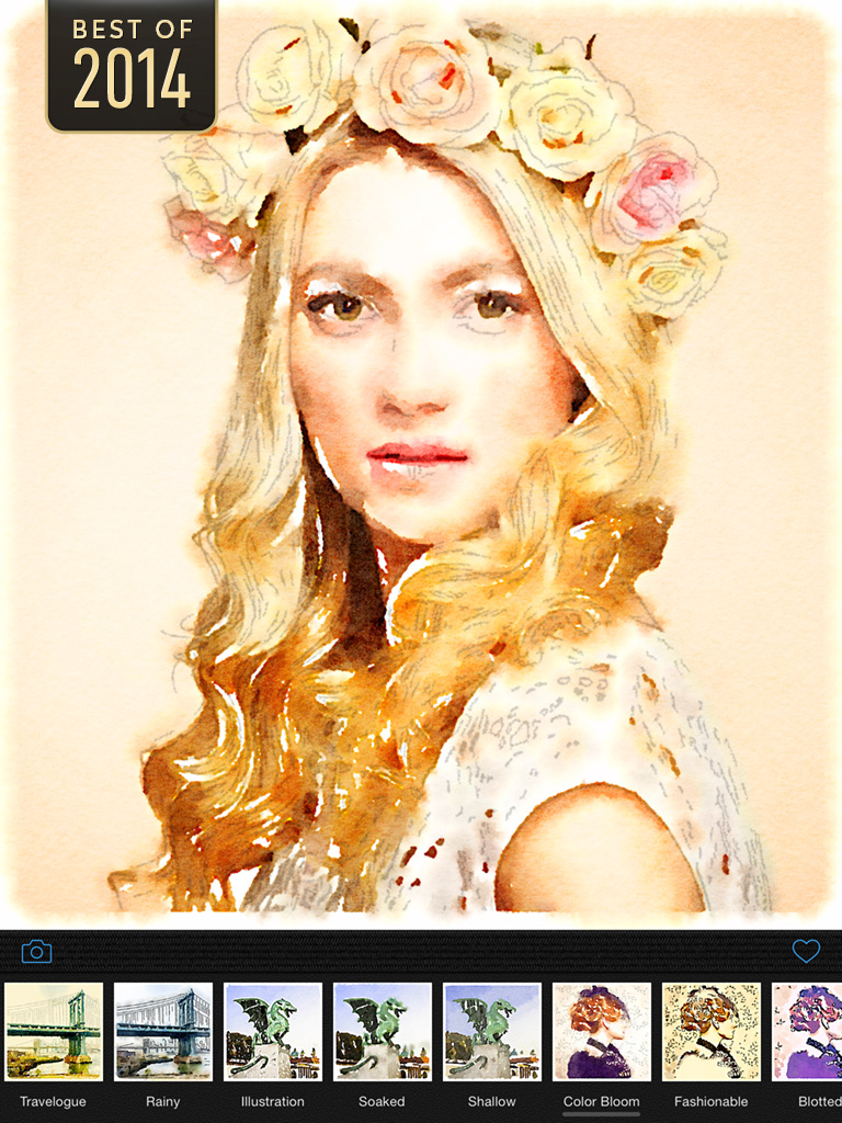
Waterlogue is a photo app inspired by Moleskine watercolor journals, urban sketching, artist’s journals and en plain air painting.

The technology developed for Waterlogue transforms your photos into spontaneous, unique, and brilliant watercolor sketches that look like real paintings.

Waterlogue distills your environment down to its essence—just the way an artist would—and turns even an on-the-fly snapshot into something luminous and sublime.

Continue Reading →

Plants by Tinybop

Forest in Summer (credit: Plants press kit by Tinybop)

Forest in Summer (credit: Plants press kit by Tinybop)

At Tinybop, I helped code Plants, an interactive kid’s app that explores the diversity of life in a collection of ever-changing biomes.
Continue Reading →

Timeline Software

I created a cross-platform timeline component for BlackBack Technologies Mac and iOS forensic analysis tool, BlackLight.

Continue Reading →

Sketch: Multi-Column Layout Algorithm

This iPad app is the proof-of-concept for an algorithm I designed to present large numbers of items in a compact layout. The concept uses a variable, multi-column format to give readers a feeling of variety on long pages.

The layout code was designed to find an optimal article layout—defined generally as the column configuration that contains the least dead space—using multiple column formats. In this test app, dead space is marked with diagonal lines; in a final app, the article heights would adjust to fill the column.

Continue Reading →

Sketch: iPad Photo Map

I pursued this internal AP project in order to learn iOS development. The project experimented with end-to-end technology: A server-side OS X application accessing the AP photo feed and delivering it to an iOS client app with a custom map component.

Continue Reading →

Double Across for iPad

I designed the graphics and interface skins for an iPad game designed and developed by Sol Robots.

Double Across is a crossword-style puzzle board game that lets you play with up to five other people, or with “famous author” AIs.

Continue Reading →

Timeline Layout Algorithm

"Flowing" timeline of the decade's events.

I decided to algorithmically lay out the elements in the AP interactive, 2000-2009: Decade in Review, because of the large amount of content—over 400 events—and very limited amount of time I had to complete the layout.

Continue Reading →

2000-2009: Decade in Review

This interactive takes 400+ events—chosen by AP editors—from the past 10 years and presents them on a continuous timeline.

Editors assigned a category-specific “priority” to each item, which is reflected by each item’s size in the timeline. Each item is clickable, bringing up an event description, full image, and photo caption.

Continue Reading →

Winter Olympic Medals

For the AP, I developed this section of a historical overview of the medals won at Winter Olympic Games. The chart components are placed dynamically after the data loads.

A force-directed graph was used to avoid overlapping boxes. Instead of a bounding circle around each node in the graph, I used a bounding box and computed overlap distance between pairs of boxes when relaxing the layout. This yielded a much more efficient “packing” of the items.

Continue Reading →

Live Global Storm Tracker

The development of the new AP storm tracking interactive and its underlying map engine involved coordination with the primary data provider and research into competing storm tracking products.

Continue Reading →

Happy GO Driver!

I produced this iOS game in collaboration with illustrator Peter Hamlin. The object is to keep the traffic flowing by controlling the traffic signals. Angry drivers and wrecks will obstruct your progress.

Level 4.

Continue Reading →

AP Economic Stress Index

This interactive maps several economic indicators (Unemployment, Foreclosure, Bankruptcy) into a composite index score on both state and county levels. The project was a collaboration across several AP bureaus.

Polygon detail reduction tools developed for the project enable the map engine to animate monthly indicator data at the county level.

Continue Reading →

2008 Election Graphics Software

The final version of the 6-column graphic

I was the architect and implementor of the entire software system responsible for generating and delivering the AP election maps graphics for print newspapers.

Continue Reading →

Herman Miller Materials Selector Algorithm

Working with Michael McGinn Design Office (MMDO), I developed a layout algorithm for Herman Miller that organizes swatch search results by color clustering. The relative position of the swatches is maintained, regardless of the density of the results.

Continue Reading →

Herman Miller Materials Program Automation

In April, 2009, Herman Miller launched the Herman Miller Materials Program, a collection of over 1,600 materials organized in 16 volumes. The Materials Program was developed by Michael McGinn Design Office (MMDO).

Working with MMDO over a period of several months in 2008, I created a desktop application to automate the production of the thousands of printer mechanicals and review and sign-off sheets that were used to support the efficient print production of the volumes.

Swatch layout uses Kohonen self-organizing maps (SOM).

Continue Reading →

Sketch: Artery Graphs

Map 2

These images are early tests for an algorithm that graph flow and movement across geography. It was prompted by a story the AP was writing on the displacement of Iraqis during the Iraq war. The technique is an algorithmic variation on flowlines.

Continue Reading →

AP Graphics Workflow and Automation Server

Stagedoor is the AP Graphics workflow and automation server software.

Watch folder configuration is done by drag-and-drop.

Continue Reading →

Geolocation Database

I’ve developed several database tools at the AP. In this project, I built a tool to aid reporters in geolocating the hometowns of US military personal killed in action in Iraq and Afghanistan.


Continue Reading →

2006 Election Graphics Software

I developed software to generate results maps for the 2006 general election. This application was based on work I developed as a consultant in 2004.

The data source for the graphics came from AP election data feeds. Results were captured and loaded into a SQL database where they were retreived and processed by my software.

My software then read in pre-designed page templates and colored the map regions based on the results. The final files were exported in a vector graphics format for AP Graphics staff to finalize page layout and copy editing.

This project’s template-based workflow is based on my SuperGraphics framework. This software allows SVG templates to be read into a DOM, modified, and output in a number of formats. SuperGraphics has advanced text handling features such as font and glyph metrics and word wrap with hyphenation.

2004 Election Graphics Software

For the 2004 US Democratic primaries and November general election, the AP needed to provide thousands of their member newspapers with print media graphics coverage of national and state results for the presidential, congressional, and senatorial races. AP contracted for my services to come up with a way to quickly and reliably create these graphics based on large data sets.

Continue Reading →