All posts in Interactives

2000-2009: Decade in Review

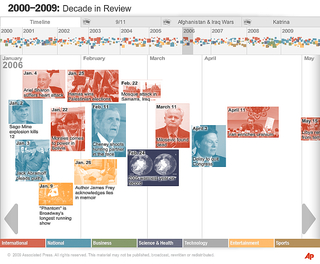
This interactive takes 400+ events—chosen by AP editors—from the past 10 years and presents them on a continuous timeline.

Editors assigned a category-specific “priority” to each item, which is reflected by each item’s size in the timeline. Each item is clickable, bringing up an event description, full image, and photo caption.

Continue Reading →

Winter Olympic Medals

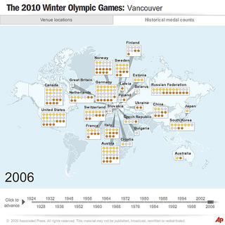
For the AP, I developed this section of a historical overview of the medals won at Winter Olympic Games. The chart components are placed dynamically after the data loads.

A force-directed graph was used to avoid overlapping boxes. Instead of a bounding circle around each node in the graph, I used a bounding box and computed overlap distance between pairs of boxes when relaxing the layout. This yielded a much more efficient “packing” of the items.

Continue Reading →

Live Global Storm Tracker

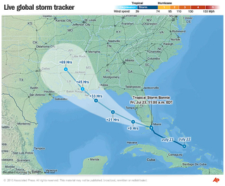
The development of the new AP storm tracking interactive and its underlying map engine involved coordination with the primary data provider and research into competing storm tracking products.

Continue Reading →

AP Economic Stress Index

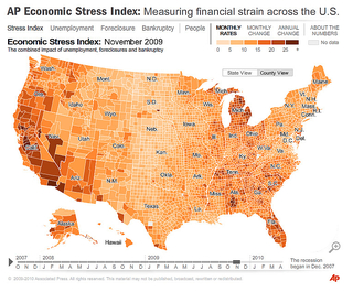
This interactive maps several economic indicators (Unemployment, Foreclosure, Bankruptcy) into a composite index score on both state and county levels. The project was a collaboration across several AP bureaus.

Polygon detail reduction tools developed for the project enable the map engine to animate monthly indicator data at the county level.

Continue Reading →