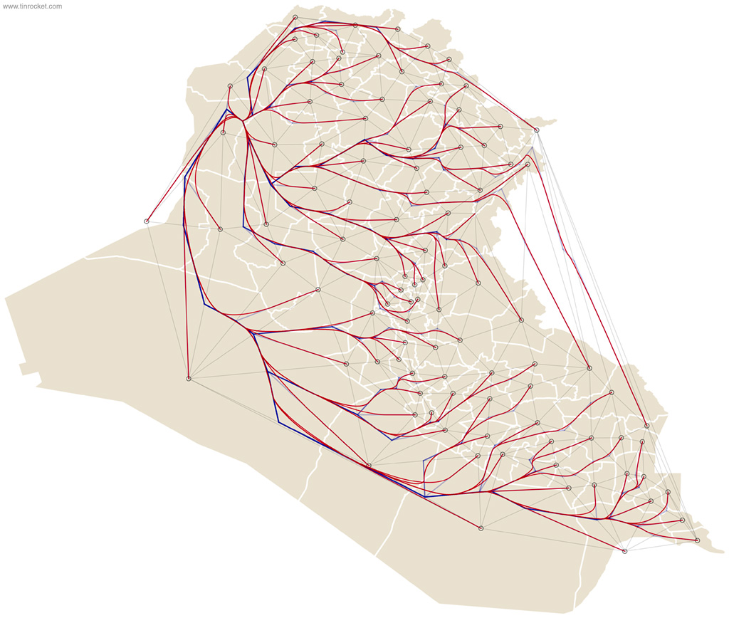
These images are early tests for an algorithm that graph flow and movement across geography. It was prompted by a story the AP was writing on the displacement of Iraqis during the Iraq war. The technique is an algorithmic variation on flowlines.
The base GIS map was converted to SVG and then loaded into a DOM. The software:
- Creates a barycenter point from each geographic region
- Constructs a Delaunay triangulation network of all points
- Maps the path from a starting point to any other region
For testing purposes, these graphs map the network from one region to every other region. The output is vector PDF data.
Further work would have:
- Smoothed out the bends in the path while maintaining self-collision avoidance
- Graphed the quantity of flow by changing the path thickness
- Added A* path optimization
- Used input data of the gain/loss between territories.
- Animated the flowline spread
If the source data were detailed enough, this would have been used as an interactive map: The user would select a region to show where the population dispersed to, or the reverse, where an influx of population came from.


