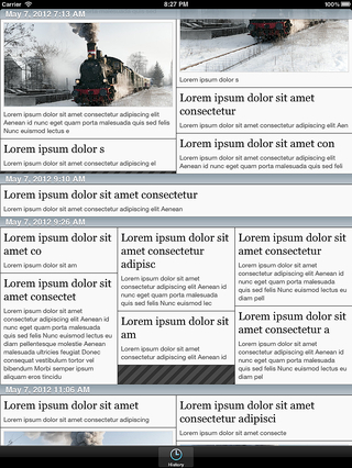
This iPad app is the proof-of-concept for an algorithm I designed to present large numbers of items in a compact layout. The concept uses a variable, multi-column format to give readers a feeling of variety on long pages.
The layout code was designed to find an optimal article layout—defined generally as the column configuration that contains the least dead space—using multiple column formats. In this test app, dead space is marked with diagonal lines; in a final app, the article heights would adjust to fill the column.
In order for the app to compute the layouts on the iPad at run time, there are constraints on the problem:
- Time order is maintained in columnar format first, followed by left-to-right.
- The number of columns is limited (one to four).
- The algorithm works with a small, variable set of articles at a time. The upper bound on this set gives the algorithm a limited look-ahead ability.
- The algorithm can choose a configuration that uses fewer articles than it was given.
- Each column layout ends in a horizontal boundary.
This app implements the scrolling view using a UITableView. Each column layout is displayed in a UITableViewCell. Cells are enqueued and dequeued by the system. A layout will only draw itself when its cell is enqueued.
A few other heuristic and parameter tweaks were implemented in order to create pleasing layouts. For instance: contiguous repetition of column formats is not allowed, e.g., a 2-column section would never immediately follow another 2-column section. The algorithm also prefers fewer, rather than more, articles per chunk.


