All posts in Interface

Waterlogue

HeroIpadBestOf2014

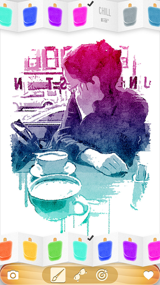
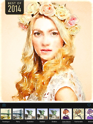
Waterlogue is a photo app inspired by Moleskine watercolor journals, urban sketching, artist’s journals and en plain air painting.

The technology developed for Waterlogue transforms your photos into spontaneous, unique, and brilliant watercolor sketches that look like real paintings.

Waterlogue distills your environment down to its essence—just the way an artist would—and turns even an on-the-fly snapshot into something luminous and sublime.

Continue Reading →

Percolator

Treble—introduced in version 2.0; Hero shot

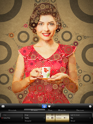
Percolator combines unique visual effects processing with a beautiful, retro, coffee-themed user interface (UI) and refined user experience (UX) design. The mosaic technology used in Percolator is based on a proprietary circle packing algorithm.

Continue Reading →

Popsicolor

Inktensity—introduced in version 2.2

Inktensity—introduced in version 2.2

Released six months after the 1.0 release, Popsicolor 2.0 is a significant update to my illustration-inspired photo app. The app is currently at version 2.2.

Continue Reading →

Timeline Software

I created a cross-platform timeline component for BlackBack Technologies Mac and iOS forensic analysis tool, BlackLight.

Continue Reading →

Experimental iOS App: Pixel Art Meets Global Illumination Rendering

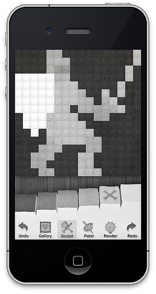
This experimental iOS Graphics app is ½ old-school 2D pixel editor and ½ 3D global illumination renderer. I developed a ray casting algorithm that uses low- resolution depth and color maps to produce a high resolution rendering with subtle lighting and shading.

From left to right: depth map (user created), color map (user created), depth + color (used for final render), global illumination rendering.

Continue Reading →

Double Across for iPad

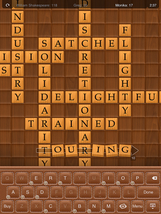
I designed the graphics and interface skins for an iPad game designed and developed by Sol Robots.

Double Across is a crossword-style puzzle board game that lets you play with up to five other people, or with “famous author” AIs.

Continue Reading →

Winter Olympic Medals

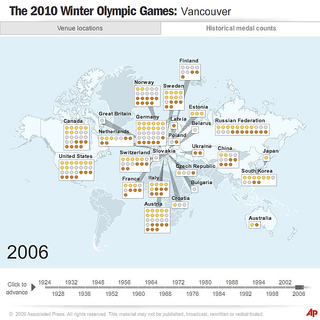
For the AP, I developed this section of a historical overview of the medals won at Winter Olympic Games. The chart components are placed dynamically after the data loads.

A force-directed graph was used to avoid overlapping boxes. Instead of a bounding circle around each node in the graph, I used a bounding box and computed overlap distance between pairs of boxes when relaxing the layout. This yielded a much more efficient “packing” of the items.

Continue Reading →